
BEYOND
In association with Xerox
Issue 60 | September 2021


Well, well, well.
I never thought that one-day I'd sit down and voluntarily write about a printing press, which is what I'm doing right now.
I've been to print shows and seen the state of the art machines. Great big silver or black or white boxes. I've made the "ooh" and "ahhh" noises expected of me without ever appreciating how those presses represent the extraordinary power creative people have to influence science and technology.
It's the word 'beyond'.
Xerox are running ads for their new Iridesse print system, urging designers to think 'Beyond CMYK'. This month they are hosting a webinar for up to 500 creative people and the theme is 'Beyond CMYK'.
And there it is, the insatiable desire of creative people for MORE. More choice, more opportunities, more colours. It's a desire that goes back to pre-history.
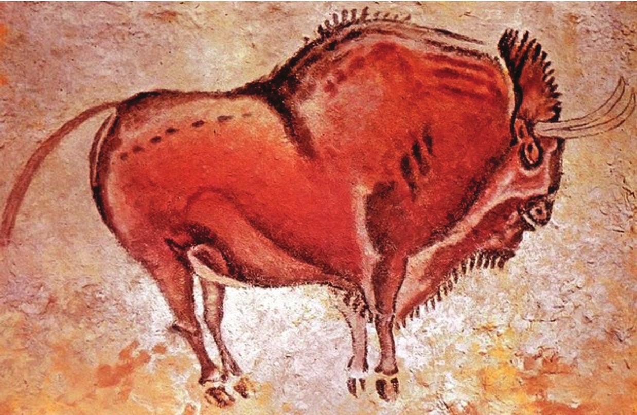
If the very first smudges and attempts to understand the world were made in black outlines, the first colour pretty much everywhere was red ochre.
100,000 years ago, it seems our ancestors were decorating themselves with it before learning how to apply it to cave walls.
But the Palaeolithic colour palette of black and red wasn't enough. There were dreamers who started experimenting with iron oxide, manganese and kaolin to get deeper, purplier reds as well as white.
40,000 years ago there were technologists among them who didn't just grind the minerals into powder, they experimented by mixing them with orchid sap, egg yolk and animal fats to make paints that wouldn't fade.
Amazingly, some of the pigments found in the cave paintings of Lascaux did not come from locally found minerals. In other words, 20,000 years ago the artists of the time valued colour so highly they traded for it. There was an industry.
The techniques used to make paints and dyes didn't really change all that much until the Renaissance when binding pigments in walnut or linseed oils rather than with egg yolk became the norm. The only problem was that the colours of oil paints tended to get darker as they dried. The greatest mind of the time applied itself to finding a solution. It was Leonardo da Vinci who transformed art by discovering that heating the oil first helped the colours dry brighter.
So, if reds and blacks were the only available hues at first, secondary colours such as yellow and white began to appear, from yellow ochre and calcite, before a third wave of browns, purples, pinks and greys.
Meeting the demands of artists (not to mention a public that's always been equally keen for novelty and progress) was exhausting and dangerous work.
In Rome, only Emperors wore purple because it was so fiendishly hard to extract from the murex shellfish. Apparently it took 10,000 of the critters to make a single gram of dye, which, as a result, was three times more expensive than gold.
Vermilion was horribly expensive as well. Originally made from the crushed, dried bodies of cochineal insects native to Mexico, pigment-makers in 8th century China found they could extract it from cinnabar, a mineral that also contains mercury. Making it toxic. Miners died so the Emperor could write in red ink.
Greens have been deadly too. Scheele's Green was a bright green pigment that just happened to be blended with arsenic before anyone knew that arsenic was tricky. One theory is that Napoleon in exile was killed by the poisonously veridian wallpaper on his bedroom walls.
Paris Green that replaced it wasn't any better. In fact, it's said to have been responsible for Cézanne's diabetes and Monet's blindness.
Funnily enough, blue, the world's favourite colour, is relatively new.
The ancient Greeks, not to mention the Japanese and the Chinese, didn't have a word for it. They described it as a kind-of green.
Around 2,200 BC the Egyptians started making it by combining limestone and sand with azurite, a copper-containing mineral, and heating it the mix to 900°C. That created a blue glass, which they then crushed, mixed with glues and gums and voilà! Artists now had sea and sky.
Ultramarine was another colour more expensive than gold. Five times more expensive, in fact. It came from lapis lazuli, which, at the time, could only be found in the remote mountains of Afghanistan. In mediaeval times artists clamoured for it, even if it pushed them into debt (as it did Vermeer, who bought too much of it.)
Even though I studied art history at university, it's only now thanks to Xerox and researching this that I have an answer to a question that long puzzled me. Why, in all paintings of the Madonna in the Renaissance, does she have a blue gown over red? Because it was expensive. Because it was important. Because it was devotional. Because if she was in yellow and grey it would have been sacrilege.
Colours have meaning.
Blue for boys and pink for girls, for instance, although this is a recent bias. In 1918 the British Ladies Home Journal noted, 'the generally accepted rule is pink for a boy. The reason being pink being a more decidedly strong colour is more suitable for a boy...'
Whichever way you look at it, pink is loaded.
In Nazi Germany, homosexuals were labelled by the pink triangle they were forced to wear on their chests.
Looking beyond (that word again) the one colour, Gilbert Baker created the rainbow flag in 1978 to symbolise LGBT pride. He had eight colours in his rainbow. That's one more than there is in an actual rainbow. At the top, hot pink for sex, then red for life, orange for healing, yellow for sunlight, green for nature, turquoise to represent art, indigo for harmony and violet, at the bottom, for spirit.
Originally, there were just five colours in the rainbow. It was Sir Isaac Newton who added orange and indigo for no better reason than that seven was a mystical number. Seven musical notes, seven heavenly spheres, seven wonders. He wanted everything in the natural world to be connected.
(Incidentally, his experiments pushing light through a prism provided the inspiration for one of the most famous album covers of all time, Pink Floyd's 'Dark Side of the Moon'.)
Just as the history of art has been the ever-increasing availability of an ever-expanding range of colours, the history of print has been the same.
The first colour print we know about is a two-colour frontispiece to a Buddhist scroll made in China and dated 1346.
In Japan, the techniques involved in woodblock printing became increasingly complex to meet the demand for more colour. More often than not, it could only be met by hand-painting the monochrome print.
It was the same in Europe. At first, Gutenberg printed black on white. He did try to add red but passing the pages twice through his press proved too difficult.
But after him came others who did find ways to print in layers. In the 1790s, Alois Senefelder, a hard-up playwright in Germany discovered, accidentally, that he could print his plays cheaply by preparing and inking limestone tablets. What was brilliant about his invention of lithography (from the Greek, meaning 'stone writing') was it gave artists more freedom than engraving or etching.
By the time Henri de Toulouse Lautrec was brightening up Paris in the 1890s with his posters, the repeated overprinting of inks was producing fabulous results.
But not fabulous enough.
Creative people are never satisfied with the status quo.
They need to push boundaries. It is hard-wired into them.
Chromolithography had shown what was possible when colours were added to an image. By now colour theory was sufficiently advanced for the RGB model to emerge. The primary colours of red, green and blue when mixed appropriately can reproduce a broad range of hues. BUT not broad enough. Apart from anything, they are too dark. Well, too dark for people working in the print industry but fine for TV and computer screens, which use RGB.
Which is how we ended up with CMYK.
Cyan, magenta, yellow and 'key', which is always black.
Why not CMYB?
Because in the early days of four-colour presses it was thought apprentices might load blue last of all and screw up the job.
Cyan is green and blue, magenta is red and purple so there is more subtlety in the mix while yellow lifts the whole lot so the print is lighter and the image closer to reality.
CMYK can reproduce about 70% of all the colours we see with the naked eye.
Which satisfies most people. Except the awkward squad, that small group of people who are always looking over the horizon.
They're the people pushing the print industry to continue innovating.
Except that Xerox, with its history of invention (58,000 patents filed since 1930) has a bunch of 'em actually inside the organisation.
Asking annoying questions such as, why can't we print silver or gold? How about fluorescents? What happens if you print with clear ink? Can you print with six colours?
And guess what? It turns out you can print with metallics. You can get fluorescent pink. You can get amazing embellishments if you print with clear or print with white. You can be more startling and more arresting in your communications. And Xerox is blazing the trail.
And that's great.
But the questions remain, as they have since the dawn of time: what else is there? What more can we do? And how can we do it better?