
Cover story
Issue 61 | January 2022


Creative people.
Doh! Why do they have to leave everything to the last moment?
It looked as if there were only three or four entries to our competition to design the covers for Directory 61.
Then, once the entry deadline was extended by a week, in they came.
30 designs from around the world.
From students, from art directors and from design professionals. Even one from a copywriter who thought he’d give it a go.
And a very good go he gave it.
The brief was to celebrate creativity on the cover of the magazine that exists to celebrate creativity.
It was also to take design beyond CMYK.
To use Xerox Iridesse and print with Metallics, Florescent Pink, Clear and White.
Or to use iGen5 and go Clear, White or Fluorescent Yellow.
To match more Pantone® colours with Gamut Extension.
Or to use mixed fluorescents on Versant and Primelink.
So many options, so many opportunities.
A shortlist of 15 was put to a judging panel comprising Evelyn Truter, Head of Marketing for Xerox EMEA, Kevin O’Donnell, Head of Marketing (Graphic Communications and Production Systems) Xerox UK, Ileana Barber, Production Colour Manager at Xerox Los Angeles, Amy Stear, Global Marketing Manager, Xerox New York, Erika Zimmet, Principal and Creative Director of the Zimmet Group and yours truly, Patrick Collister, Editor of Directory.
Honourable mentions to:
- Luka Cooper, a student at Lincoln University in the UK. The judges liked the idea of ‘out of the box’ thinking. And Luka’s colour palette was nothing if not intense.
- Matt Batten, Creative Director of Momentum Worldwide, Australia. The concept came to him in a dream. Creative people are in a black void looking for a speck of an idea while the heat of pressure intensifies.
- Chris Booth, a digital artist in the UK. ‘Creativity comes from a swirling vortex of inspiration and imagination plus a magical sprinkling of golden dust.’
- Candela Camacho. With Iridesse metallics, the jury believed her design had the potential to look amazing.
After much cheerful discussion, the shortlist was whittled down to four winners in four categories of the Xerox Best of the Best Creative Awards.
Many congratulations to:
Ian Clark, Managing Director at Michael Egan Associates, UK: Beyond CMYK – Best Use of White.
Dave Hunt, Designer at Michael Egan Associates, UK: Beyond CMYK – Best Use of Fluorescents.
Kris Mento, Head Designer, Topinc Print, Cape Town, South Africa: Beyond CMYK – Best Use of Clear.
Dijith A K, Designer at Abys Design, Calicut, Kerala, India: Beyond CMYK – Best Use of Metallics.
Four great pieces of work but only one could go on the cover.
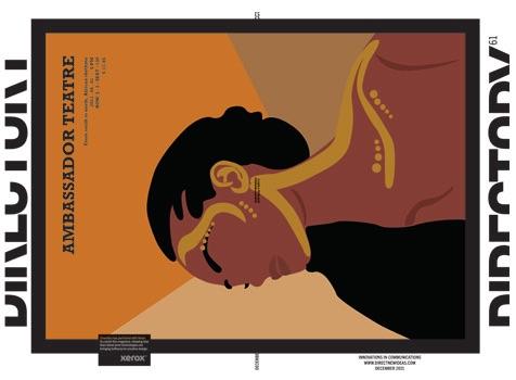
Unanimously the judges voted for Dijith A K’s ‘Bird’.
“The brief was all about colour,” Dijith explained. “I thought immediately, birds are colourful and I took it from there. Ideas fly high.”
Sometimes, the best creative ideas are the least complicated.
As part of his prize as winner of the Best of the Best, Dijith got a consultation with print experts Amy Stear from Xerox and Erika Zimmet, founder and creative director of the eponymous Zimmet Group. Erika brought with her to the meeting ace designer and Iridesse expert Bailey Dougherty. And this was when Dijith’s idea really began to take off.
In his original, perhaps not knowing quite how Iridesse works, the only gold on show was as spot colour on some of the breast feathers. What Bailey did was to use gold as an underlay beneath the bird and across the back cover while flooding the front with silver. This gave the feathers a lovely shimmer, which was accentuated by the few spots of CMYK she retained.
What we have now is a front cover that’s predominately silver with a back that’s predominately gold.
Dijith’s design went Beyond CMYK. But Bailey took it beyond Beyond, not just transforming but amplifying just about every four-colour element within it.
Our brilliant partner at Xerox, Evelyn Truter, Head of Marketing for Xerox EMEA, was delighted by the quality of the submissions.
She said, “The competition is one of a series of events we’ve been running to get designers and art directors thinking ‘Beyond CMYK’.
For me, it’s not simply a matter of making creative ideas look better. ‘Beyond CMYK’ is about making them work better. There is a lot of evidence to show that creative with the ‘wow’ factor can dramatically improve ROI.
That’s what we’re in business to do at Xerox, to give creative people more opportunities to do ‘wow’ work because ‘wow’ work is more effective work.”
That’s a point of view that chimes well with us at Directory, where our entire focus is on creativity as a business tool.
For me, as Editor, the exercise has been a real eye-opener. I had no idea of the craft skills involved in setting up and running a press.
The range of options that Iridesse offered Bailey when she started work on Dijith’s first design was astounding.
There’s no doubt that six-pack printing, as I call it, is more sophisticated and complicated. And the results justify it.
My one sadness is that if you’re reading this online or in PDF form, you won’t appreciate how amazing the cover is. You’ll be looking at greys and browns.
Whereas, if you’ve got the printed copy in your hands, you’ll be blown away.
Thank you to Evelyn Truter, Amy Stear, Connie Thornton and Kevin O’Brien at Xerox.
Also big thanks to Erika Zimmet and Bailey Dougherty at Zimmet Group.
Not to mention Darren Eagles, our (marvellous) designer here at Directory Central, for help and guidance throughout.
And to our (equally marvellous) printers, Hobs Digital, for whom my respect has grown enormously.
If you want to know more about ‘Beyond CMYK’ and how to get yourself a free sample kit of the best of Iridesse, visit xerox.com/beyondcmyk