Utility: it’s the new creativity
Issue 17 | December 2010


Jon Waring
Creative Director, 3 Sixty
Ten years ago my business partner and I were pitching against each other. Chris and I weren’t partners then, we were competitors. The clients liked my creative approach, (‘elegant simplicity’ they said). But they were equally impressed by Chris’s commercial thinking. So, in what is still an unusual display of client insight, they suggested awarding the job to both of us, provided we could work together.
We’ve been business partners ever since and the same logic of our respective approaches has prevailed: elegant simplicity allied to commercial thinking. In fact the combination has become stronger.
Without really noticing, we have evolved our product away from digital advertising, banners, microsites and the like, and even away from web design which we think of as visible creativity, towards invisible creativity. In fact, go to most of the sites we have designed and you won’t notice anything special about them. Why? Because you will be too busy using the product or service.
Just as Billy Wilder, say, was such a brilliant director that you never notice his direction, so my role as a creative director is to keep my ideas hidden.
Take Bristol City Airport, for instance. Look at their website. Nothing whizzy about it at all. Except it has helped our clients make more money than they expected to when we were first briefed.
It’s all about the car-park. Because that’s what occupies people most about flying abroad. What are they going to do about the car?
The website shows how close to the terminal they can park; helps them pre-book their parking spaces; and makes the whole business of travel a little simpler.
So, it’s a website which is strictly utilitarian. Yet it makes people feel good about Bristol Airport (branding) but is transactional at the same time, driving sales. For me, that is creativity in action.
Over the last ten years, digital has evolved, as has our thinking, but the fundamentals of design simplicity have become even more salient. The world is more technologically complicated now than ever before and as a result people appreciate designs that make their life simpler.
The menu structure on my television baffles me. Why? We all want technology, we all understand that it can help, but we’re often frustrated by the time and emotional investment in dealing with it.
All too often, design itself gets in the way. Showy gizmology. By contrast, the effect
of simplicity is to make things look effortless or inevitable. What irony, then, to discover how hard it is to achieve. But let’s not confuse simplicity with arbitrarily removing stuff or minimalism. Giles Colborne’s Simple and Usable (recommended reading by the way) sums it up with a quote: “Simplicity does not mean want or poverty. It does not mean the absence of any decor, or absolute nudity. It only means that the decor should belong intimately to the design proper, and that anything foreign to it should be taken away.”
Paul Jacques Grillo, in ‘Form, Function and Design’ writes that?Digital tools or apps are (or, at least, should be) the inevitable consequence of a world dominated by complexity. Complexity creates only confusion or, worse, anxiety. There are expert users to whom such complexity appeals, but most people crave simplicity.
Apps force brands to focus on the utility aspect of their marketing. How easy is it for the customer to use? Do they find the app useful, helpful, does it allow them to make better-informed choices?
It’s revealing that people who experience brands in this way demonstrate a clear preference for them. The unspoken dialogue runs a bit like this. Thanks for the information, you helped me solve that particular problem, thanks. You behaved a bit like a real friend, giving me advice free and pleasantly. You were part of the solution, instead of the problem.
For me, brands can communicate so much more powerfully when, rather than SAY anything, they DO stuff. At the Hong Kong Rugby 7s, Guinness could have put up posters at the airport saying to the thousands who flew in from the UK for the weekend, ‘We hope you have a nice time’. Or they could give them a free app which translated thousands of words and phrases into Cantonese so they could ask directions and find their way around the city. That works better than just communicating a simple (simplistic) message.
When starting a digital project, we often invite a broad team of people with different skills to ruminate upon the brief. People from disciplines such as information architecture, user experience, user interface and graphic design, copywriting, back end and front end code, search, data, to name just a few. Everyone looks at the problem through an individual lens. It surprises me how frequently one very important consideration is omitted.
‘What’s the point?’
I’m not trying to be existential, just clear. What do we want the user to do or get out of the experience?
At the risk of sounding as if I am banging the drum rather too loudly for my own agency, when we were asked to look at a website for Birmingham International Airport, that’s what I asked at the briefing session. The truth is, no airport in the world is a destination in itself. Most of us just want to get in and out of the damn place as quickly as possible.
That’s why we designed the site so that there are pictures of all the destinations you can fly to from Birmingham and none of Birmingham itself.
On a larger scale, here are a couple of other examples of what I call beautiful utility.
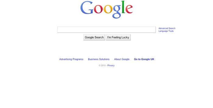
Google?.
Remember search engines before Google? They called them portals and you could check weather, stocks, shares… all stuff THEY wanted you to do or see. Then Google came along with a solitary search box. That was it. They got it. That was as much choice as a person could need. Where the web offers way too much choice, Google understood the power of simple utility.
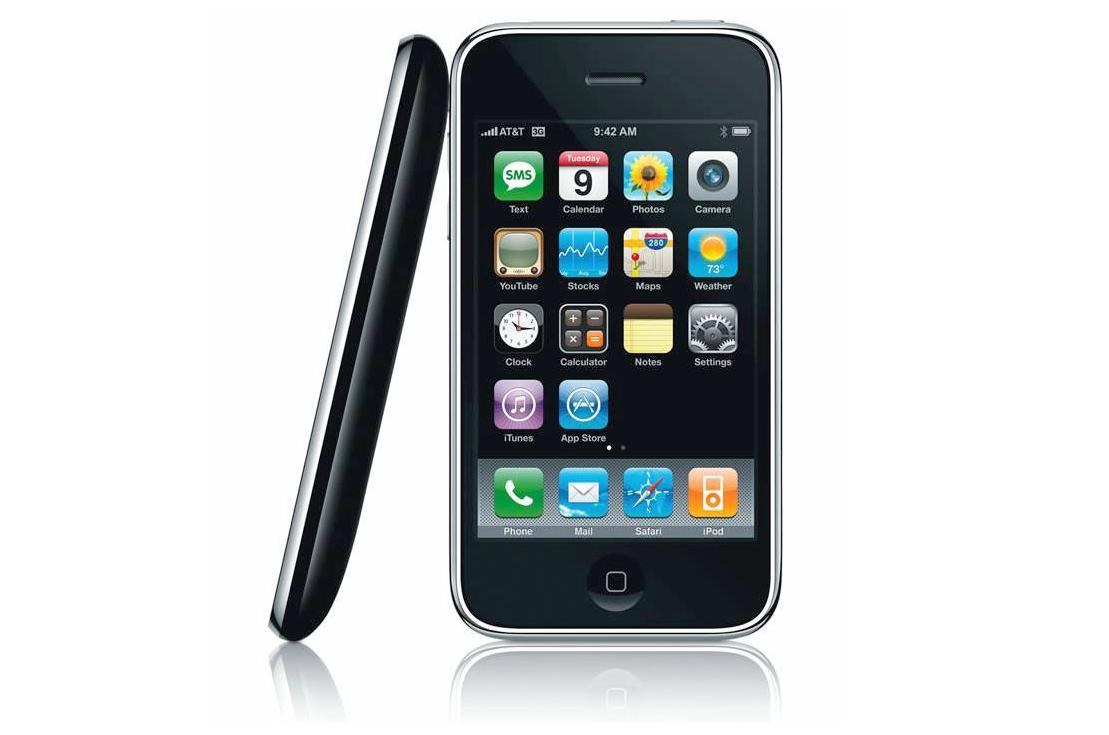
Apple
Their user interface (UI) design is so intuitive you barely need a manual. The iPhone is a wonderful example of industrial design. The actual object only has four physical buttons. The real beauty of its design lies in the UI.
Google has gone from start-up to “the most powerful brand in the world”, processing well over 1 billion search requests each day in just 11 years. And Apple is also a spectacularly profitable company. Because at the heart of both organizations is understanding that design should follow function.
You might be thinking ‘yeah, but that’s not creativity.’ I disagree. Both these examples have something in common. Simplicity and utility. Google and Apple understand the point of every project they undertake, devoting time and attention to what people really want from it; then, when they get down to the business of design, they are always innovative yet at the same time incredibly disciplined, removing anything that doesn’t contribute to its primary function.
Compare and contrast with a video camera, say, where there are so many functions it is almost impossible not to cock up by pushing something by mistake. You get the feeling that the designers at Sony are competing with the designers at Panasonic rather than thinking about their end users.Going back to Apple, everything they do is creative – even, in the eyes of most users, beautiful.
Don’t get me wrong, pure play, passive enjoyment or entertaining stuff can stir emotions, a powerful marketing tool for sure. I’m not suggesting that messaging, which is what traditional advertising has long been all about, is doomed. What I am suggesting, though, is that an increasing number of marketers are beginning to see that brand communication can, and does, make emotional connections when it helps people achieve something, contributing to lives in a constructive way and removing some of the burden of increasingly complex lives.
Thus, in the US, where the Rabbit is VW’s most economical car, CP+B created a widget that sits on your desktop advising you at the end of each day about all the free things that are happening in town. What an irresistible association for a brand.
A couple of other examples of ideas which are beautifully simple; and simply beautiful, and which I wish I’d done are:
For me, the really creative, hardworking and profitable digital work is based on a useful idea, simply executed.